
Walker Brothers Beverage Company produces craft kombucha to provide a healthier alternative to craft beer. The goal of this conceptual campaign was to build consumer awareness of Walker Brothers Hard Kombucha. The target market was health-conscious adults with active lifestyles.
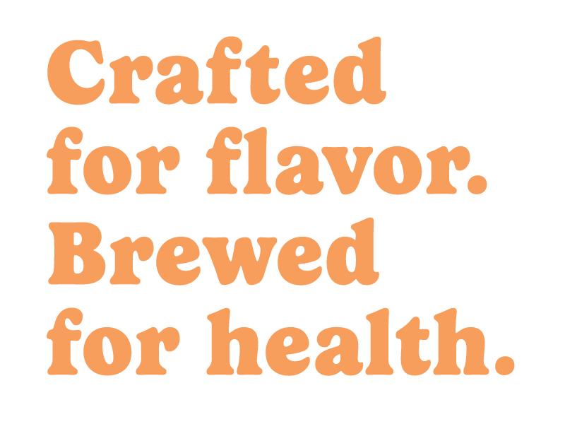
The Slogan
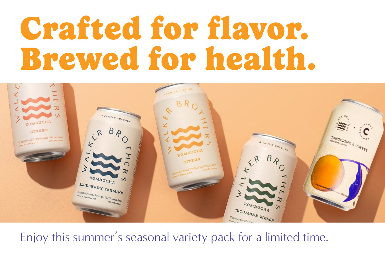
The goal of this campaign was to position Walker Brothers Hard Kombucha as a healthy alternative to craft beer. It is a beverage that provides the same complexity of craft beer, but with the added health benefits of kombucha.
When composing the slogan, I led with "crafted" to communicate the care that Walker Brothers applies to their process, while also suggesting kombucha shares a connection to craft beer. I also made sure to end with "health" in order to emphasize the benefits of kombucha to the consumer.
The Process
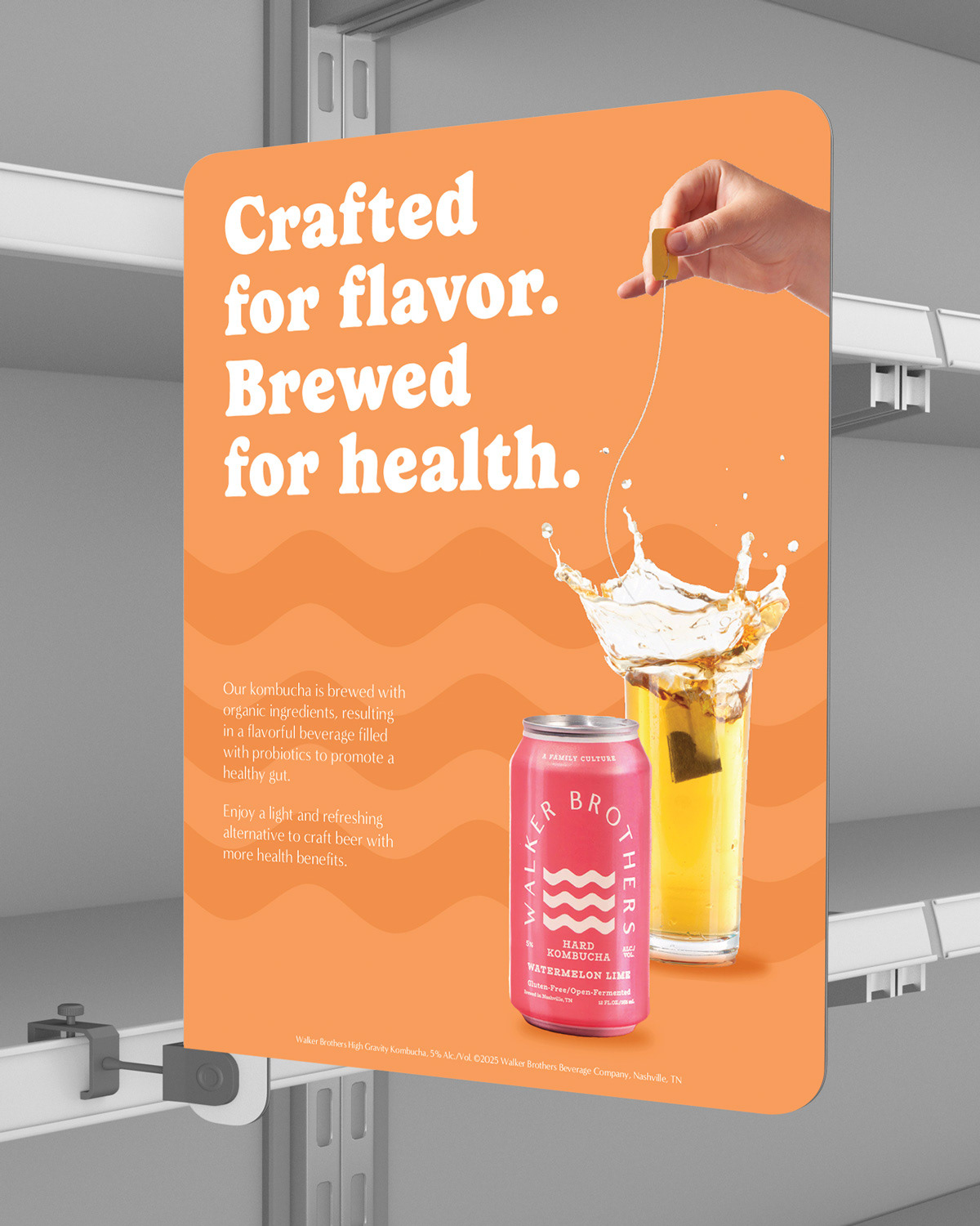
The brand personality was quirky, bright, and cheerful. These words informed my choices during the design.
I chose Gelica for the primary typeface as its bold rounded letterforms communicated that cheerful quality.
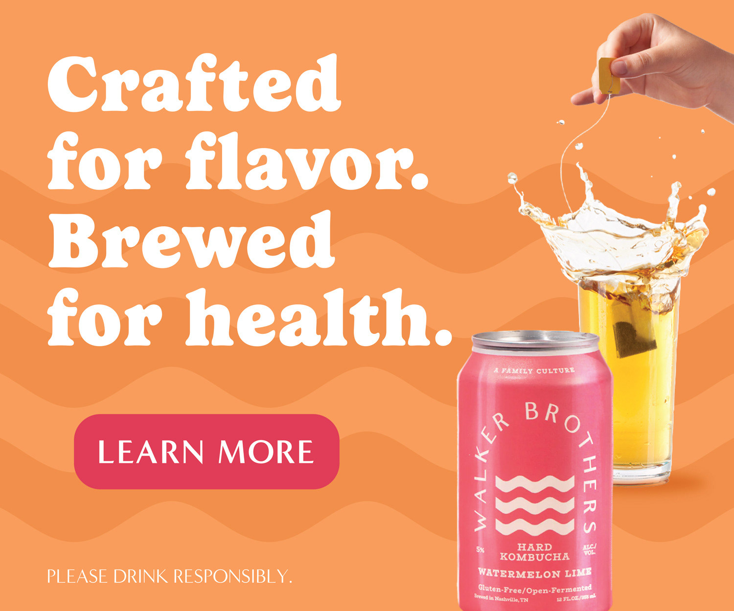
With a limited budget, there was no opportunity to shoot new photography. This meant that when defining the color palette, the existing photography informed my choices.
I knew I wanted to use an analogous color palette to create a cohesive design with bright colors. Therefore, I selected the pink can to pair with the yellow tea and orange background.
A subtle wave pattern was added to the background to echo the Walker Brothers logo.
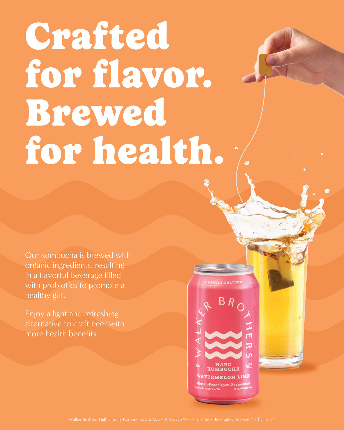
Shelf talker
Web Ads
The creative brief mandated that the product must be shown. For visual consistency, I used the color of the can to generate the color for the Learn More button.

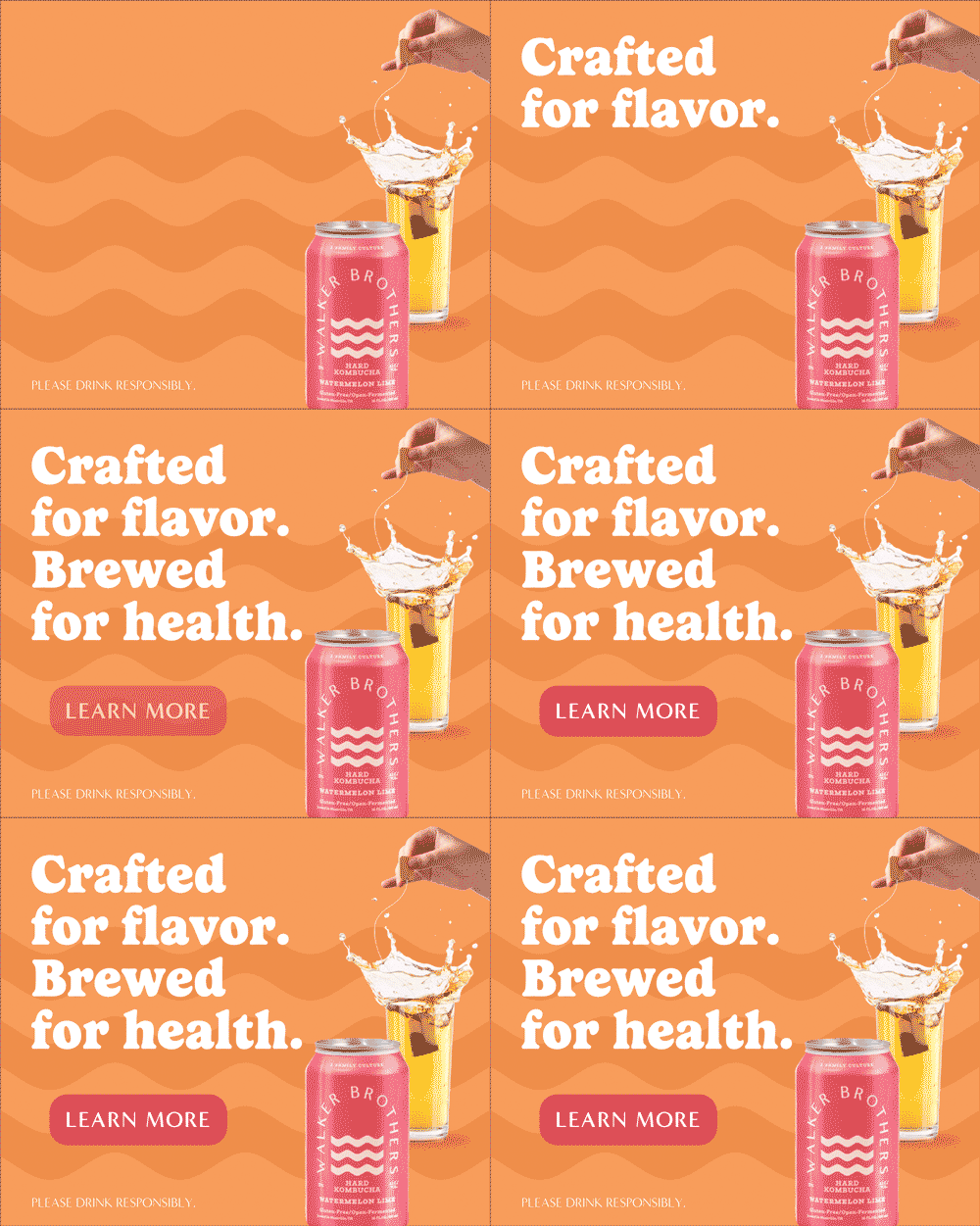
An animated mockup of the web ad was produced in After Effects to give an impression of what the final ad could look like with motion.
I chose to only animate the text to focus attention on the slogan and emphasize the campaign goal of introducing consumers to the health benefits of Walker Brothers kombucha.
Direct Mail
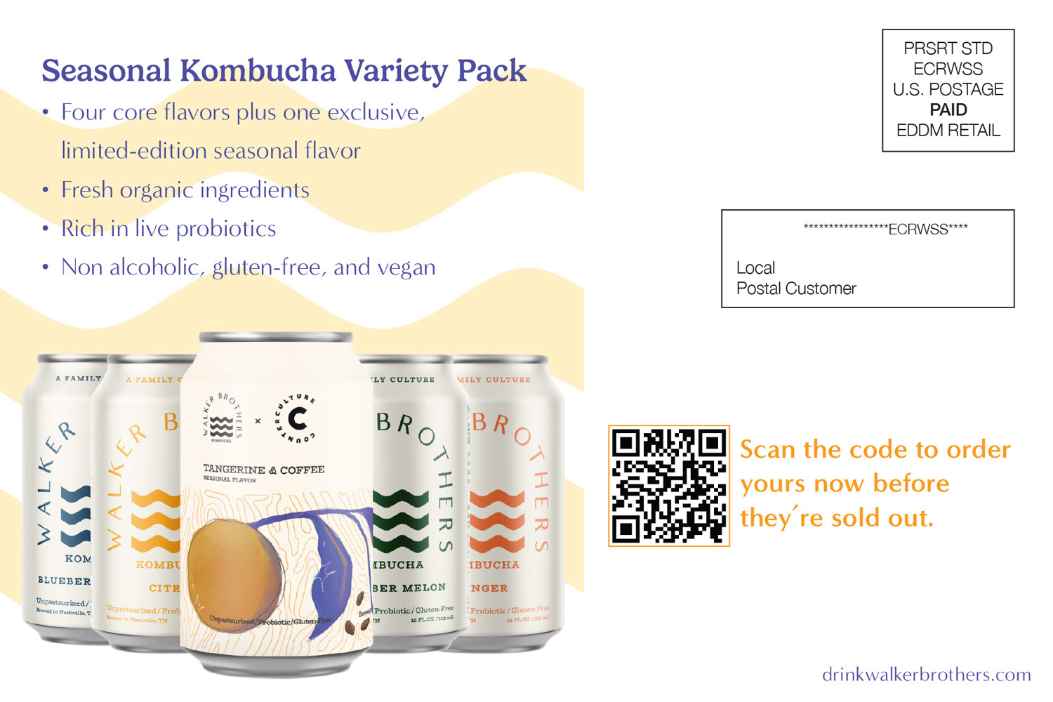
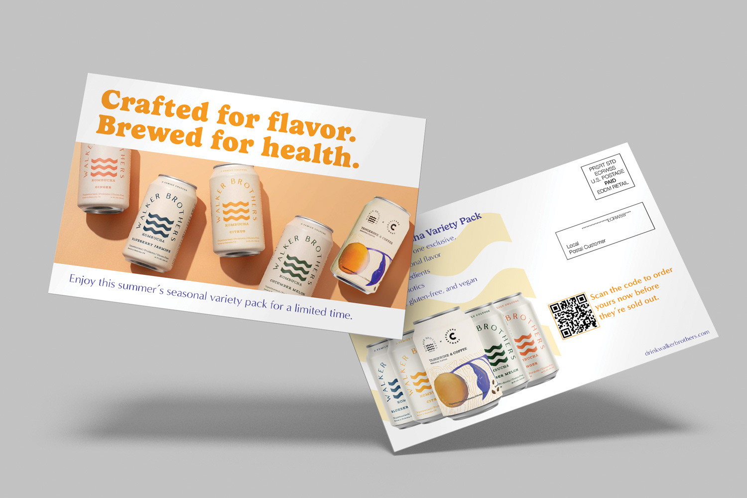
This was done to promote Walker Brothers Seasonal Hard Kombucha Variety Pack. It features the same typography and orange as the shelf talker and banner ads.
I utilized a purple for the secondary type on the front and the description on the back. This purple was drawn from the seasonal can to emphasize the promotion.