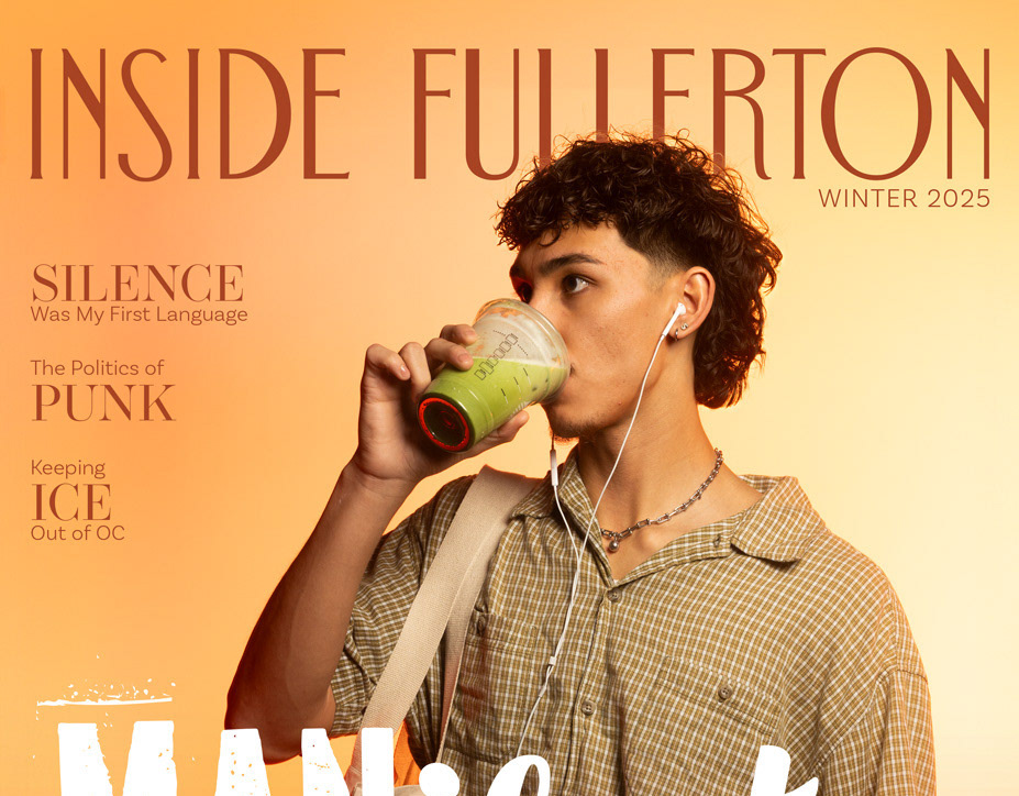
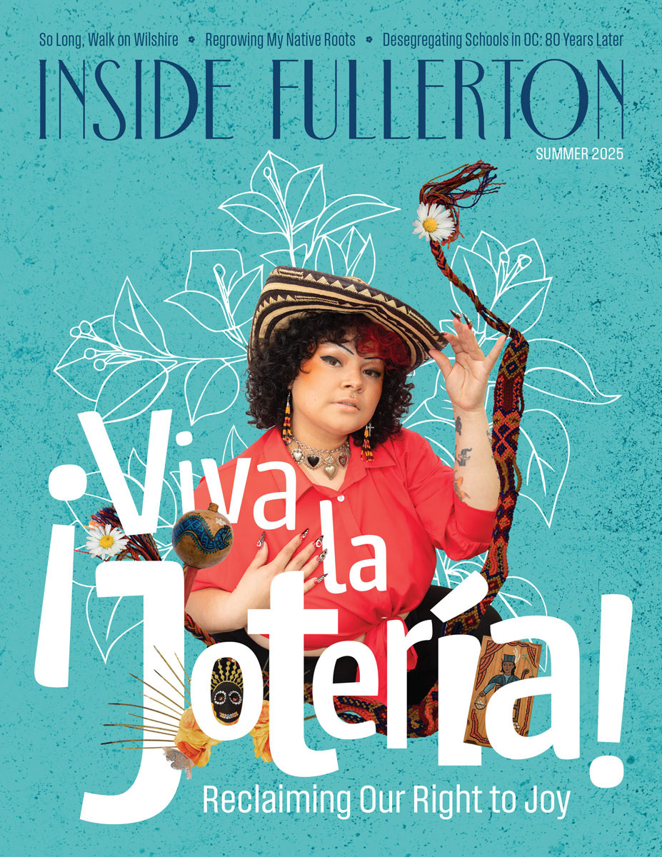

Front and back cover designed in collaboration with Juliana Vargas.
Inside Fullerton is a semiannual magazine written by the students of the Fullerton College journalism department. The articles comprise news features, profiles of local businesses, culture and lifestyle content, personal essays, flash polls and more.
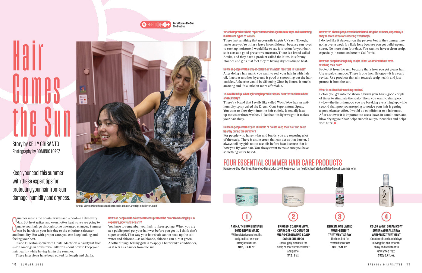
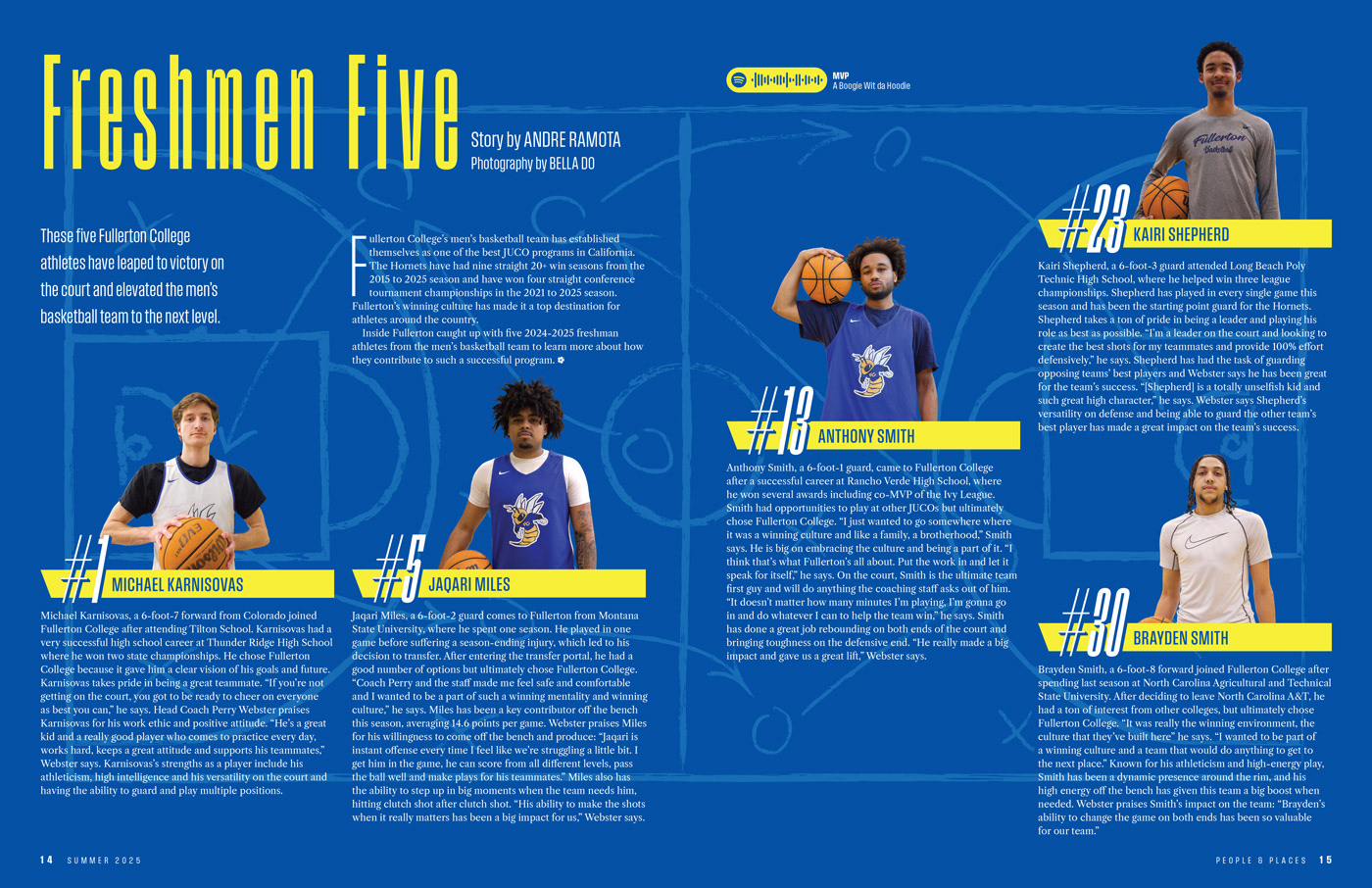
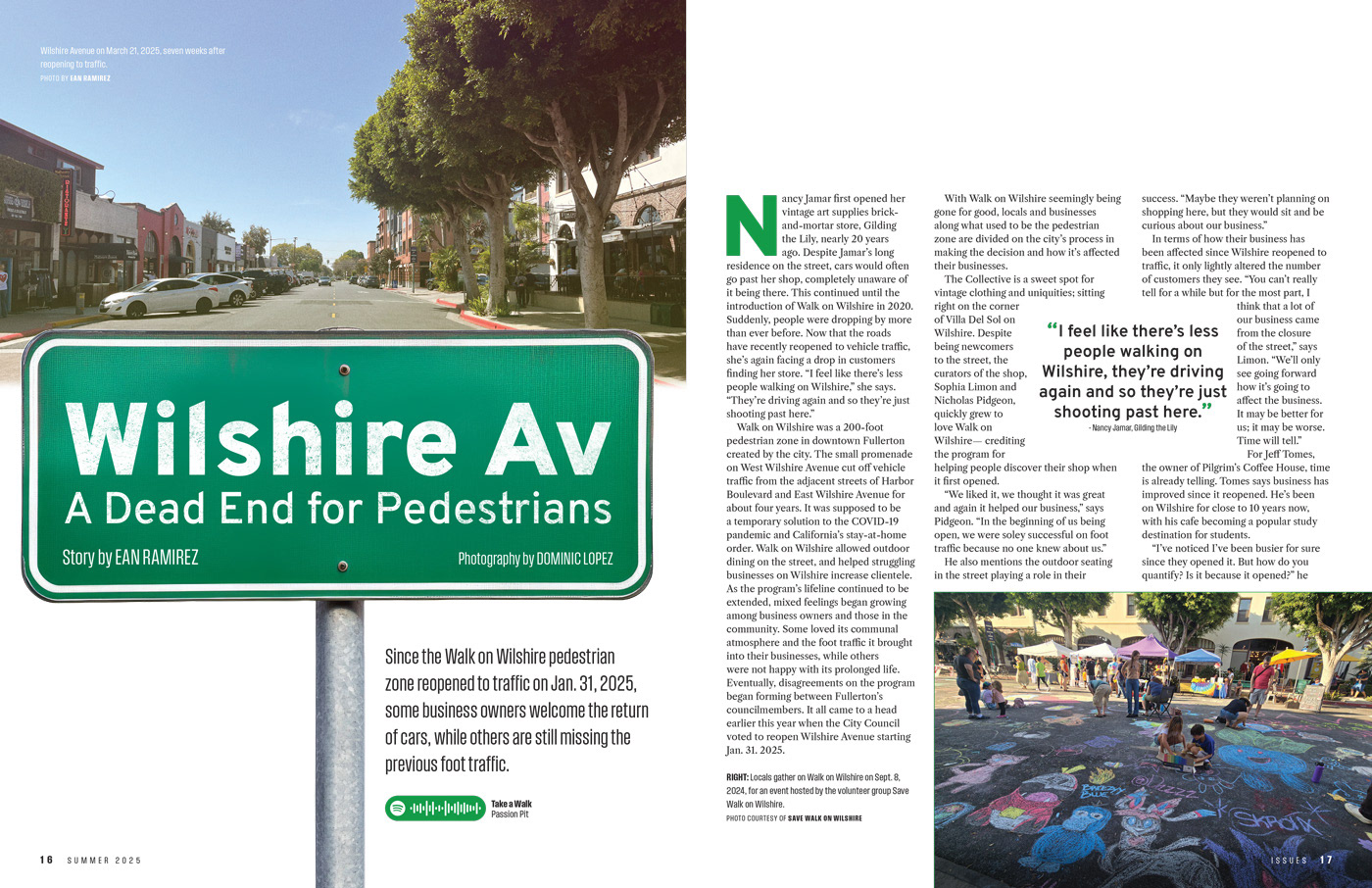
For the winter 2025 issue, I served as the assistant designer. In this role, I supported my creative director by designing several articles, collaborating on the cover, constructing a master template, and providing feedback on designs.
View the full issue here.
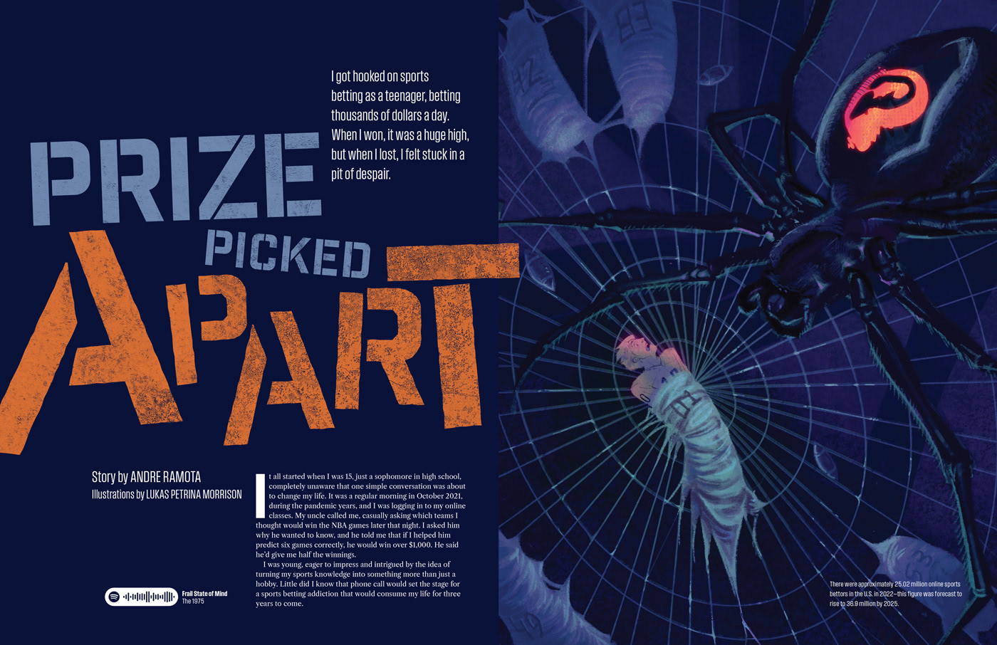

Prize Picked Apart
Second Place for Magazine Page/Spread
2025 Design of the Year, Associated Collegiate Press
Second Place for Magazine Page/Spread
2025 Design of the Year, Associated Collegiate Press
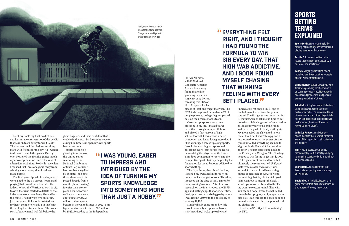
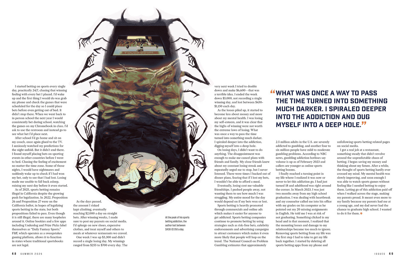
Prize Picked Apart
One of the suggestions I brought to the magazine was to save unique layouts and type treatments for articles in the feature well in order to emphasize their importance. As a feature article, this story received this unique treatment.
The story is a personal essay about becoming addicted to sports betting and the effect that this had on the author's life. To support the subject matter, I chose the Industry Inc font, a geometric sans serif typeface whose letterforms suggest the bold uppercase type of varsity jackets.
Using the stencil style was a deliberate choice so that I could emphasize the "apart" in the title by literally breaking apart the letterforms. The tilted type was used to reflect the turmoil that was caused by the author's addiction.
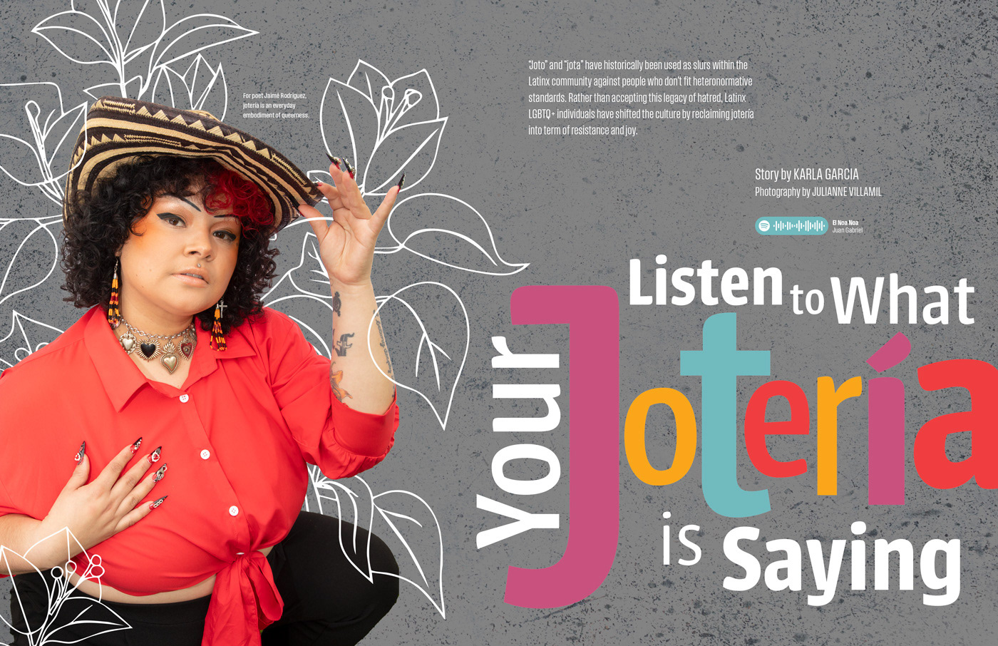
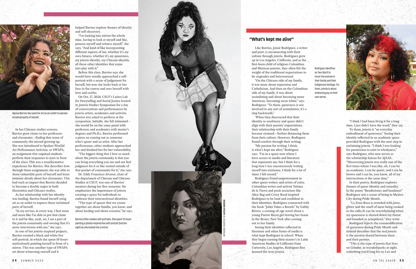
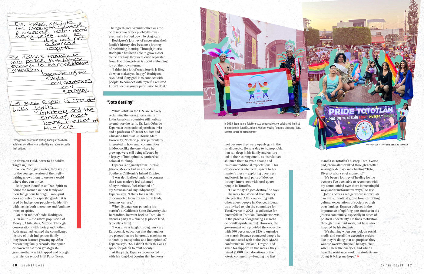
Listen to What Your Joteria is Saying
This was the centerfold article of the magazine, and I was assigned to design it before it was chosen as the cover story. The story is about the reclaiming of the term "joteria" by queer Latinx, Chicanx, and Indigenous communities and transforming it into a term of empowerment.
This article presented a unique challenge because it changes viewpoints throughout. To support the change in viewpoint, I utilized colored bars throughout the story that accompanied these different sections. To set up the color palette, I introduced them in the headline, using the colors to highlight the term "joteria."
In order to emphasize the cultural element of the story I conducted research to find a typeface created by a Latin American designer. I chose the Urbana typeface for this reason. The letterforms also communicated a Latin flair, while also conveying the fun and joy of the joteria movement and it's freedom of expression.
View the full issue here.