

The goal of this conceptual campaign was to promote Spotify as the go-to streaming platform for a personalized music experience. The primary audience was defined as tech-savvy, socially connected 18-34 years olds with an interest in music, podcasts, and streaming.
This project emphasized the use of motion in design while adhering to Spotify's existing brand guidelines.
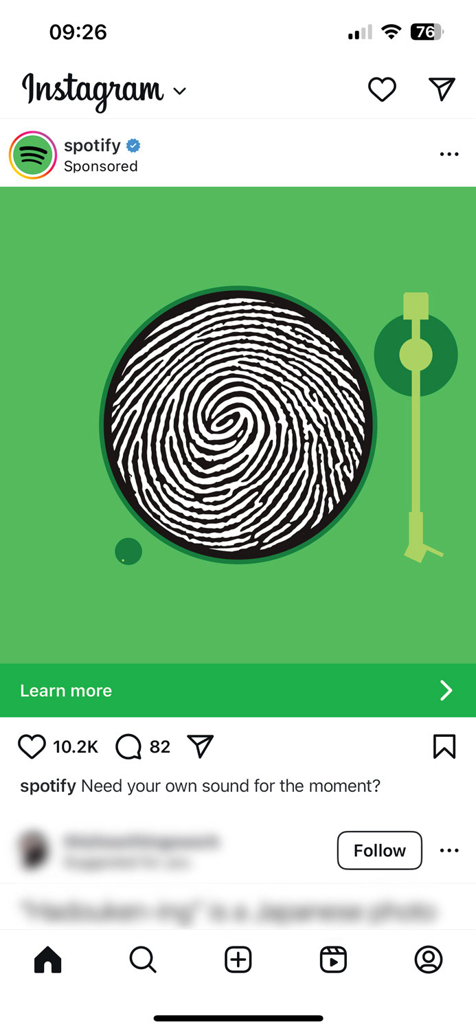
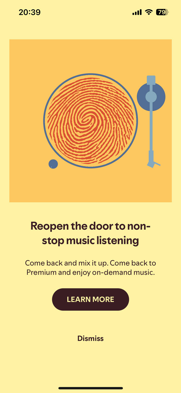
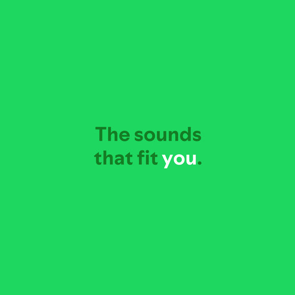
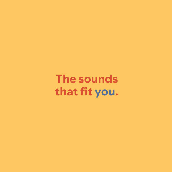
In order to engage with both new users and existing users, I developed two color palettes. To remain consistent with Spotify's existing aesthetic, I utilized bold, vibrant colors. In order to let the focus be on the animation, I chose not to employ gradients and only work with flat color.

Color palette for Instagram ad

Color palette for in-app ad
The Instagram ad was built around Spotify's primary palette, comprised of their signature green with black and white accents. This was done so new users would recognize the palette as Spotify due to past exposure or begin to build an association between these colors with Spotify.
The in-app ad featured a strong complimentary color palette to match Spotify's bold color choices. I chose orange to imply a connection to gold, suggesting the premium features an existing user would gain be subscribing to Spotify Premium.

The Print
To reflect the campaign's focus on personalization, I chose to represent this with a fingerprint. My goal was to link the ridges of the fingerprint to the grooves on a vinyl record, emphasizing that the record is unique to the viewer.
When incorporating the copy, I used color to call out the words "you" and "yours" to further emphasize the personalized experience Spotify provides.